McDonald’s Menu Design
It just got a lot easier to order a Big Mac.
One of the most robust projects that I was a part of while on the McDonald’s digital menu team was creating the next version of their digital menus. It's easily one of the largest and most complicated menus in the world. Simplifying the look and feel is essential.
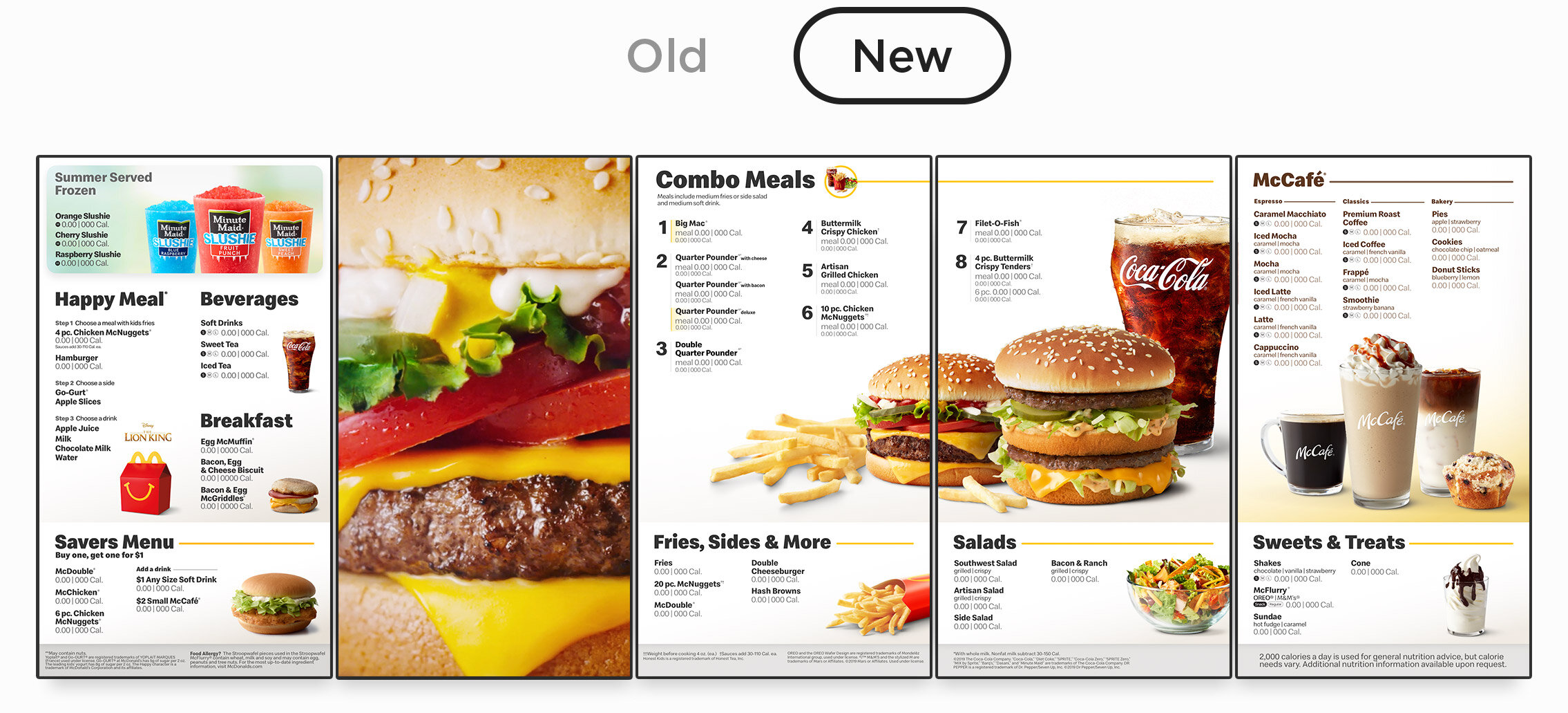
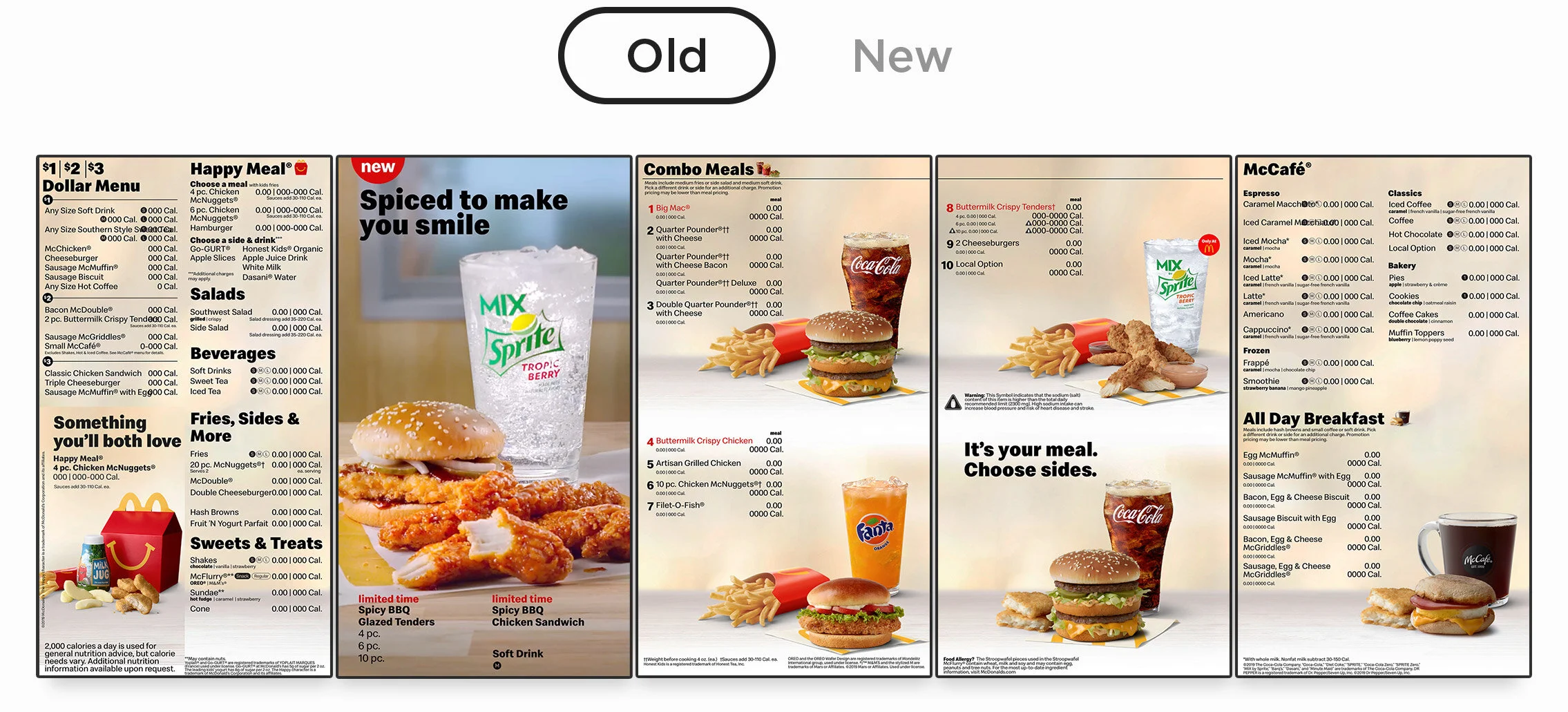
The menu has come a long way.
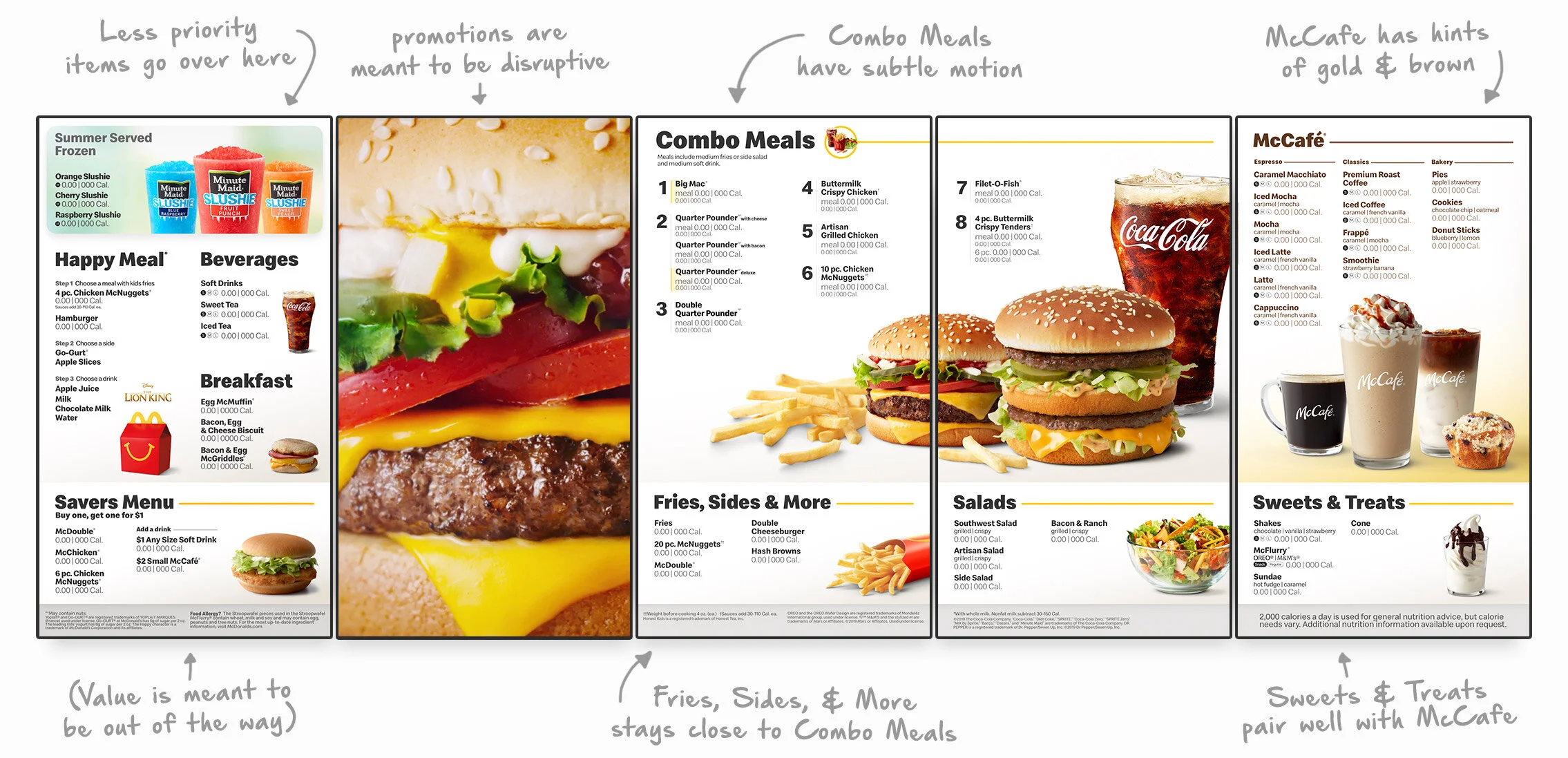
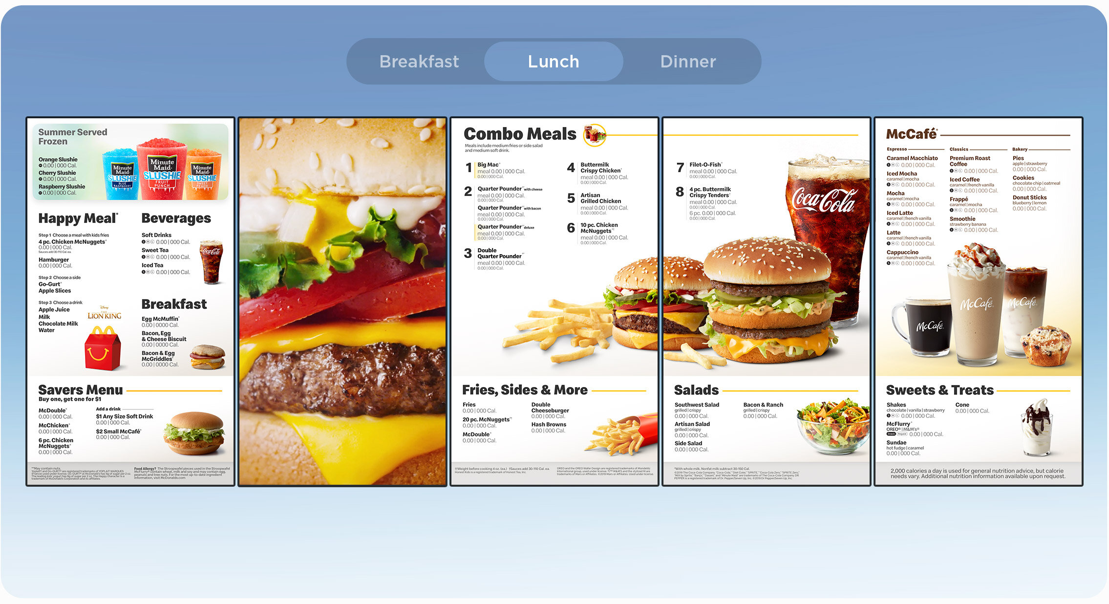
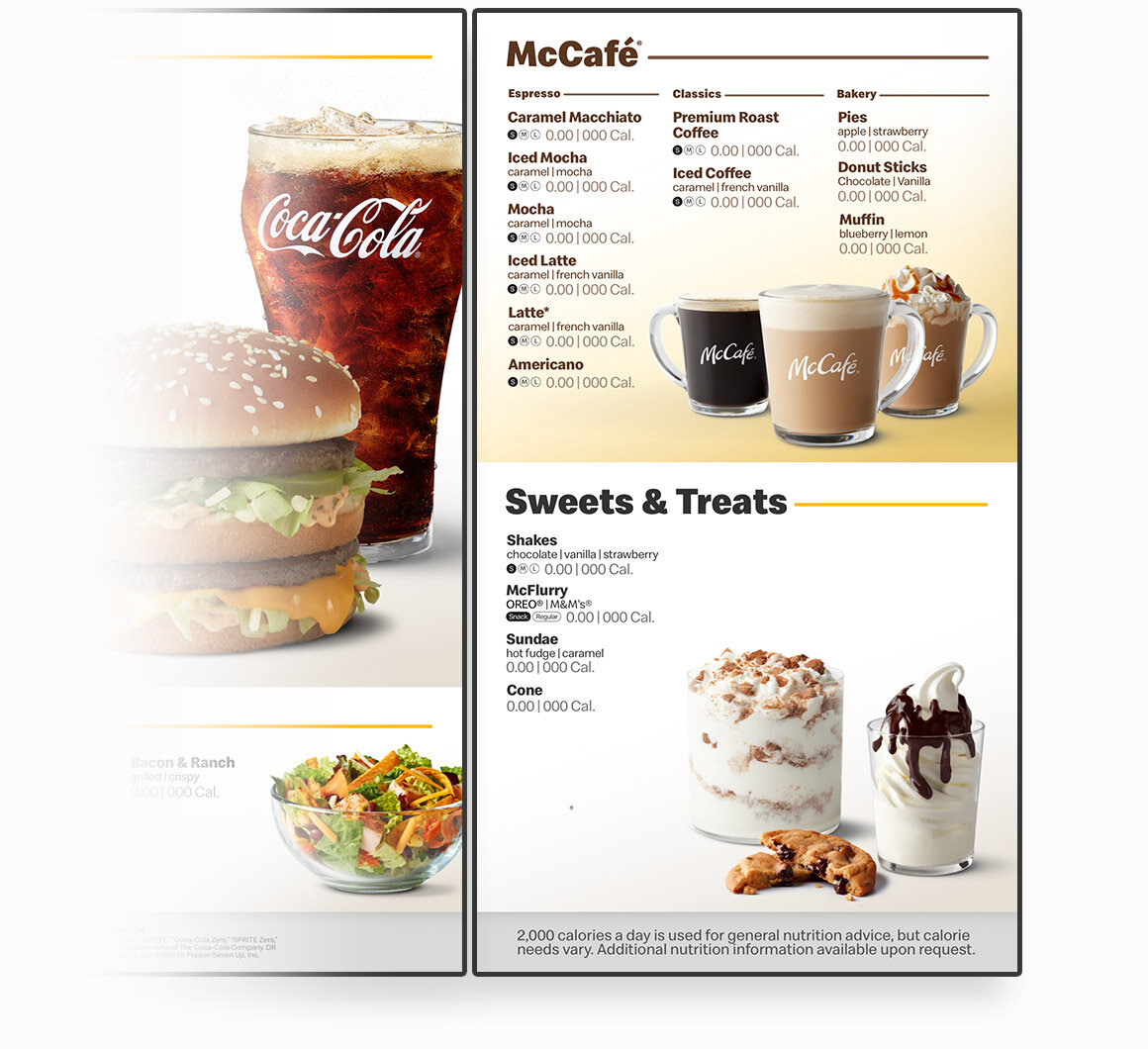
The problem with the old menu style was it was too locked into a grid. That grid gave too much space to some categories and not enough for others. With the new menu, we wanted it to feel more open/spacious by giving it a clean white background. And a goal of the new design was to have your eye move right to McDonald’s bread ‘n butter - the Combo Meals.
Built on McDonald’s Feel-Good Design.
For my design, the new menu has a foundation built on the Feel-Good Design standards we helped establish for McDonald’s.
Some top level notes:
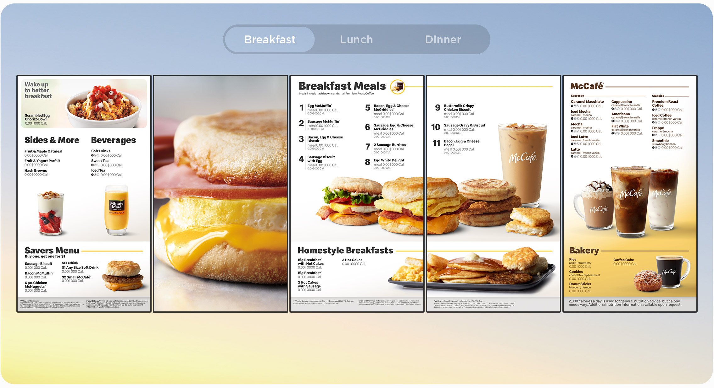
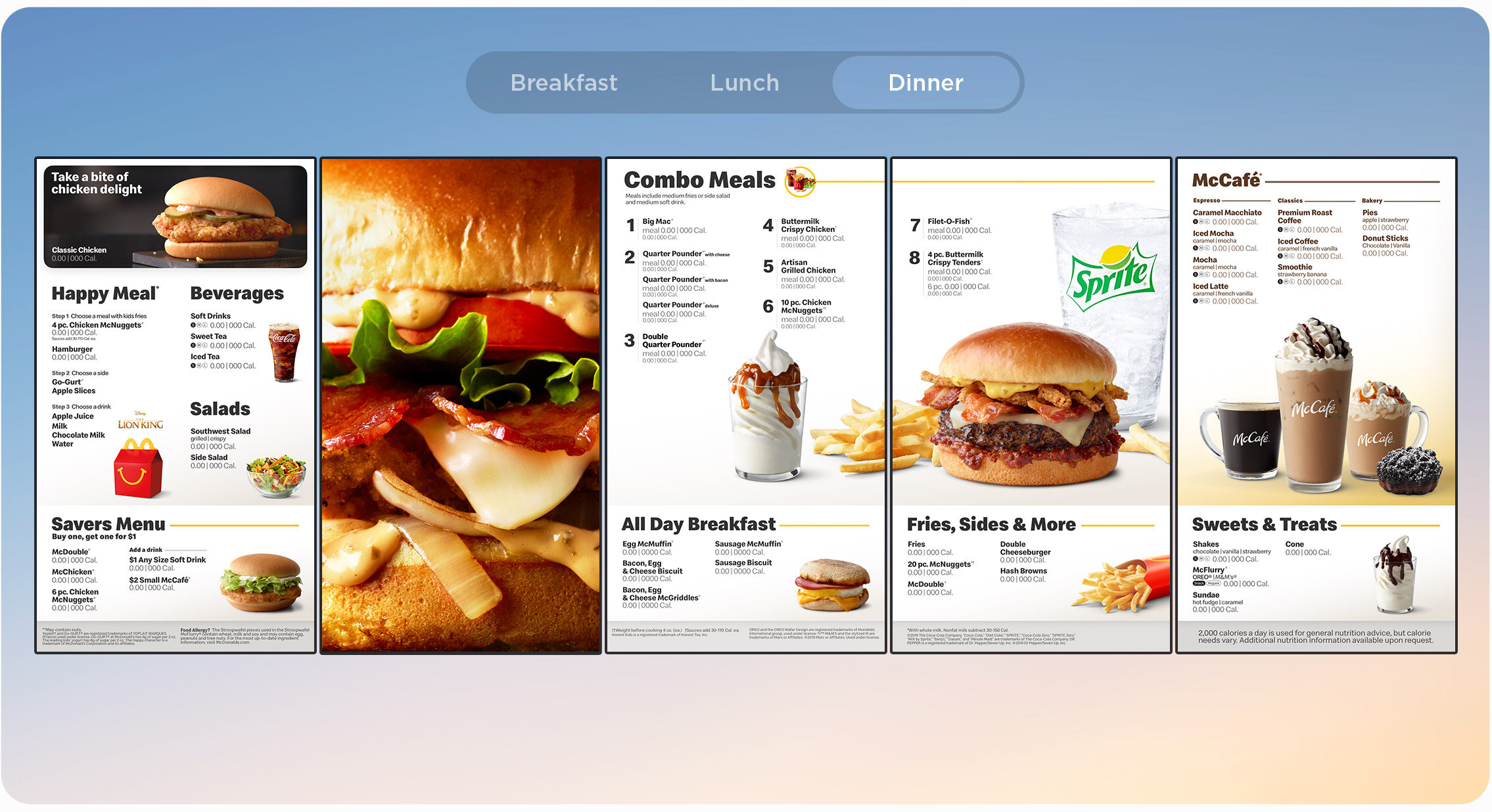
The menu changes depending on the time of day.
The menu changes and adapts to a total of 5 different day-parts: breakfast, lunch, snack, dinner, & late night.
By breaking up the menu into these separate times of day, we can reduce categories like McCafé during dinner, or expand Fries, Sides, & More during the snack day-part.
Takeovers that bring the menu to life.
During certain, less busy times of the day the menu has the capability of showing off some incredible motion footage. The menu becomes more of a enticing backdrop to the restaurant.
Replacing images has never been easier.
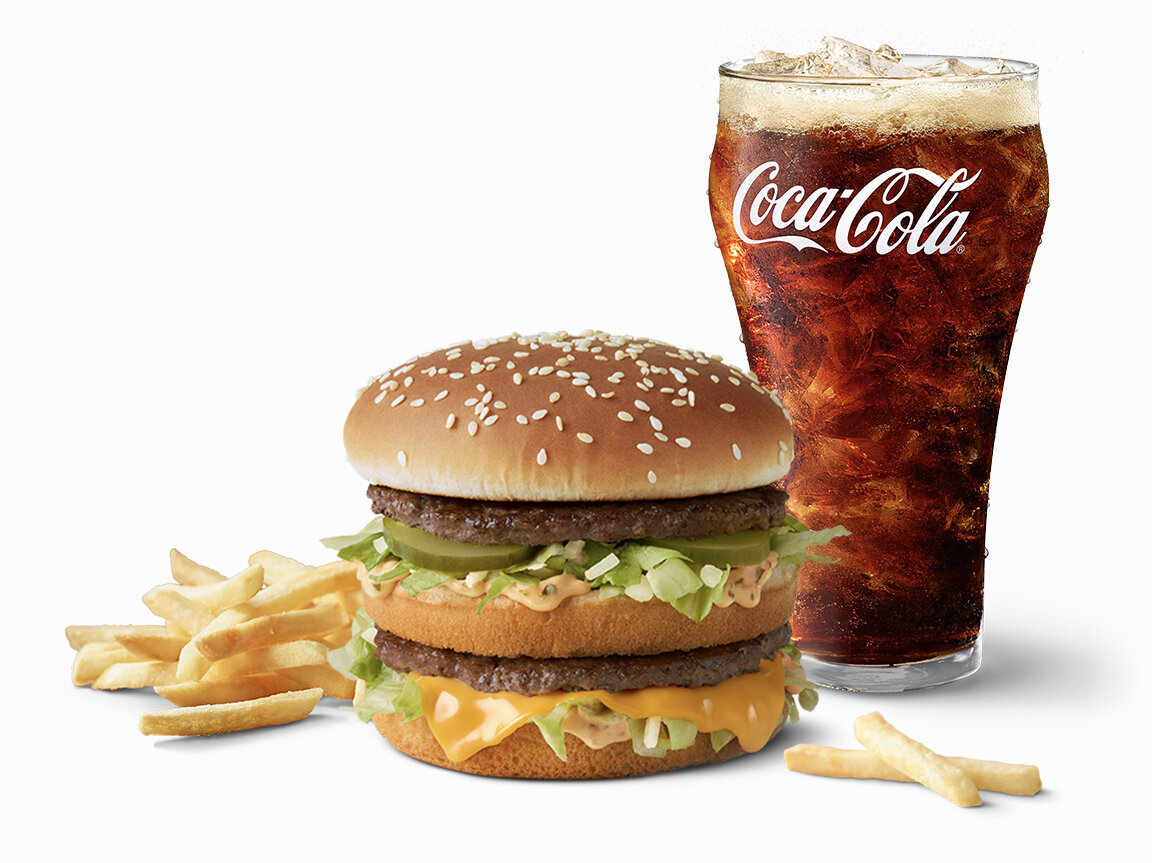
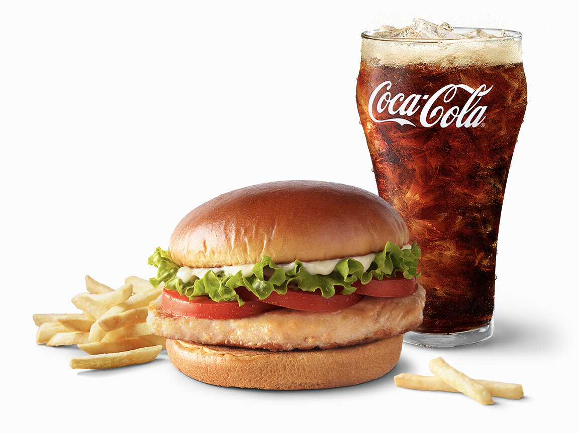
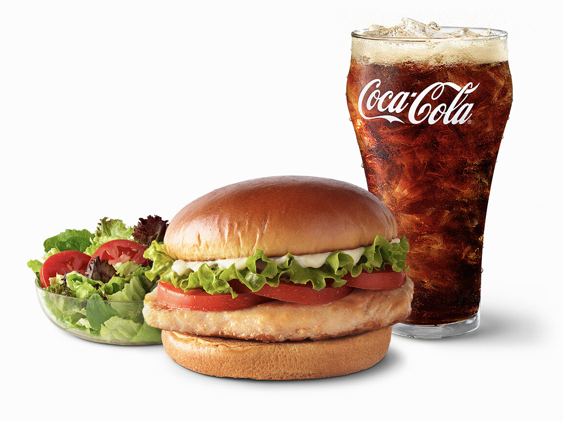
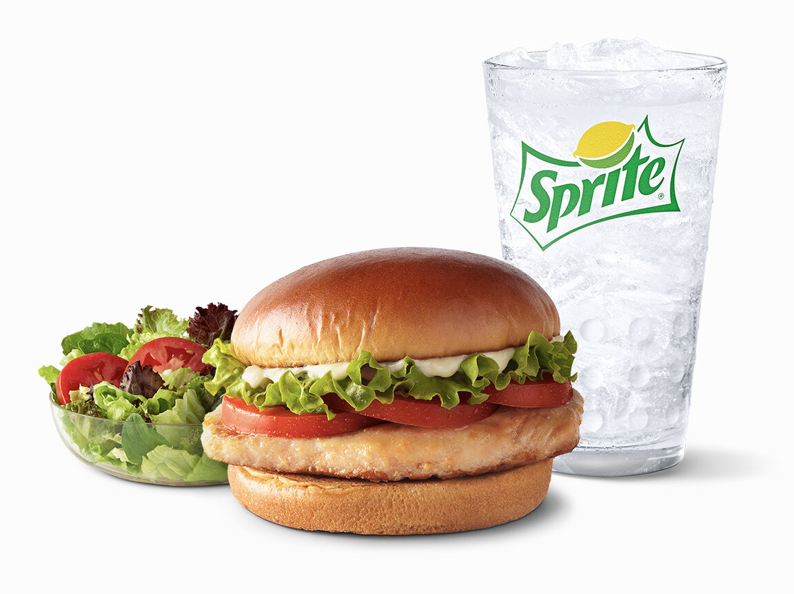
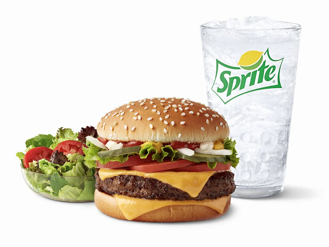
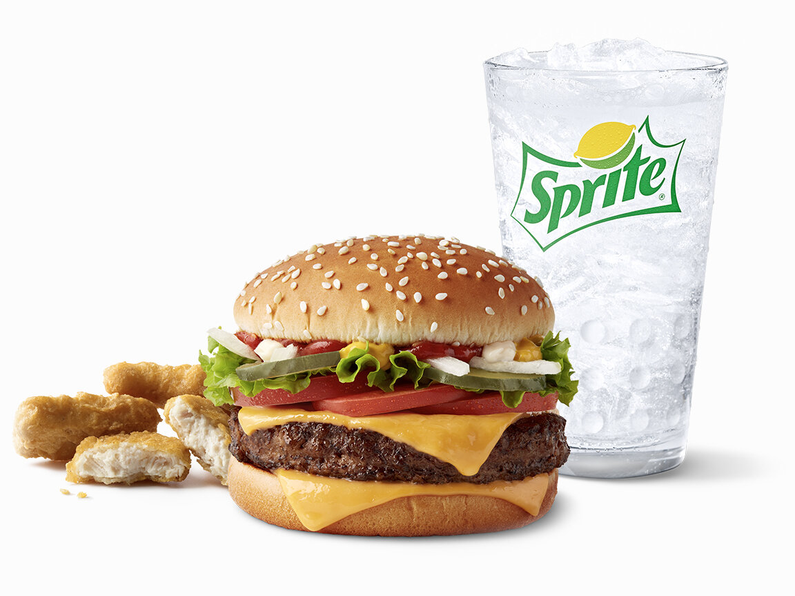
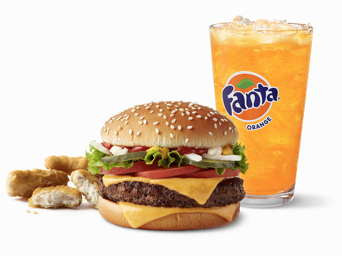
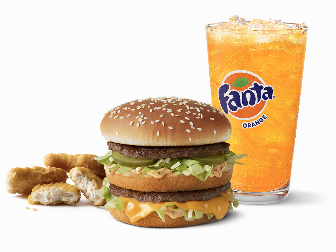
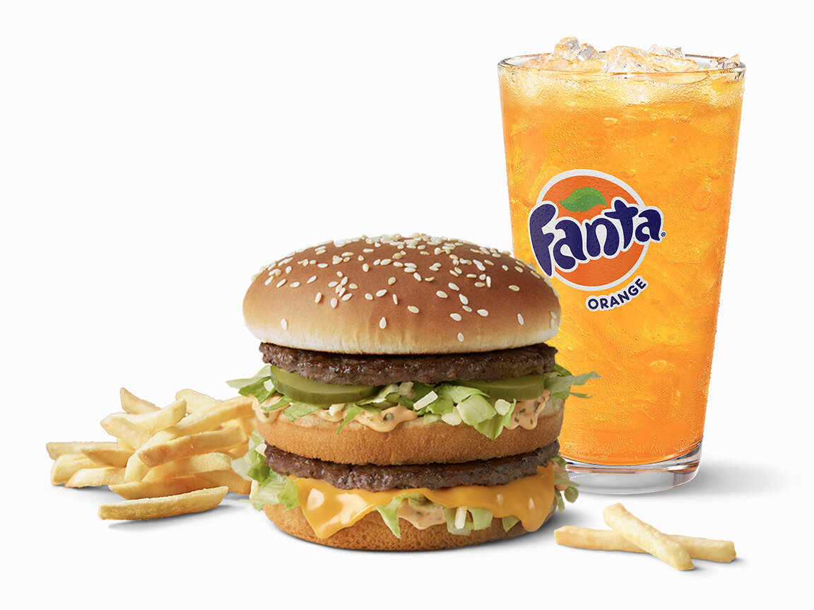
By leveraging our enormous food library of images that I helped establish, all the menu items can easily be swapped with others.
Some restaurants might want to feature a chicken sandwich instead of a burger. Now the owner/operator has the option to change it.
Product categories that were built to be modular.
By using Sketch and Abstract together, the McDonald’s menus can change to account for a all 15,000 restaurants across the US.
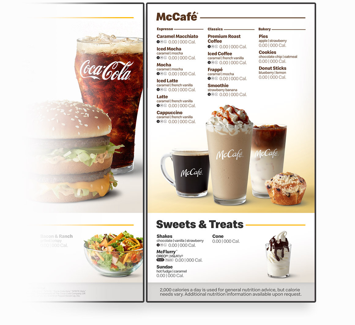
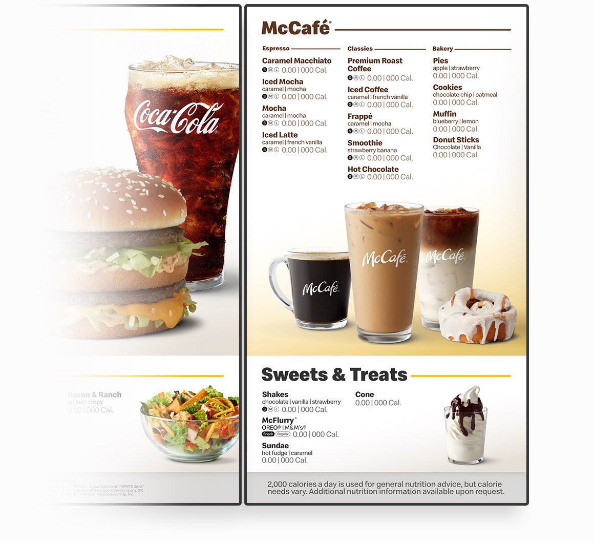
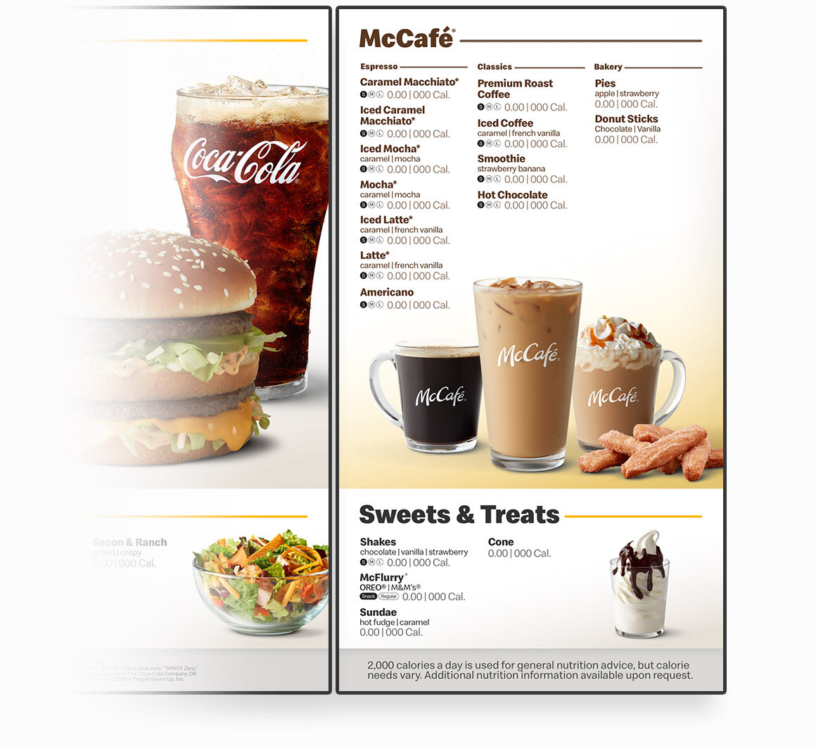
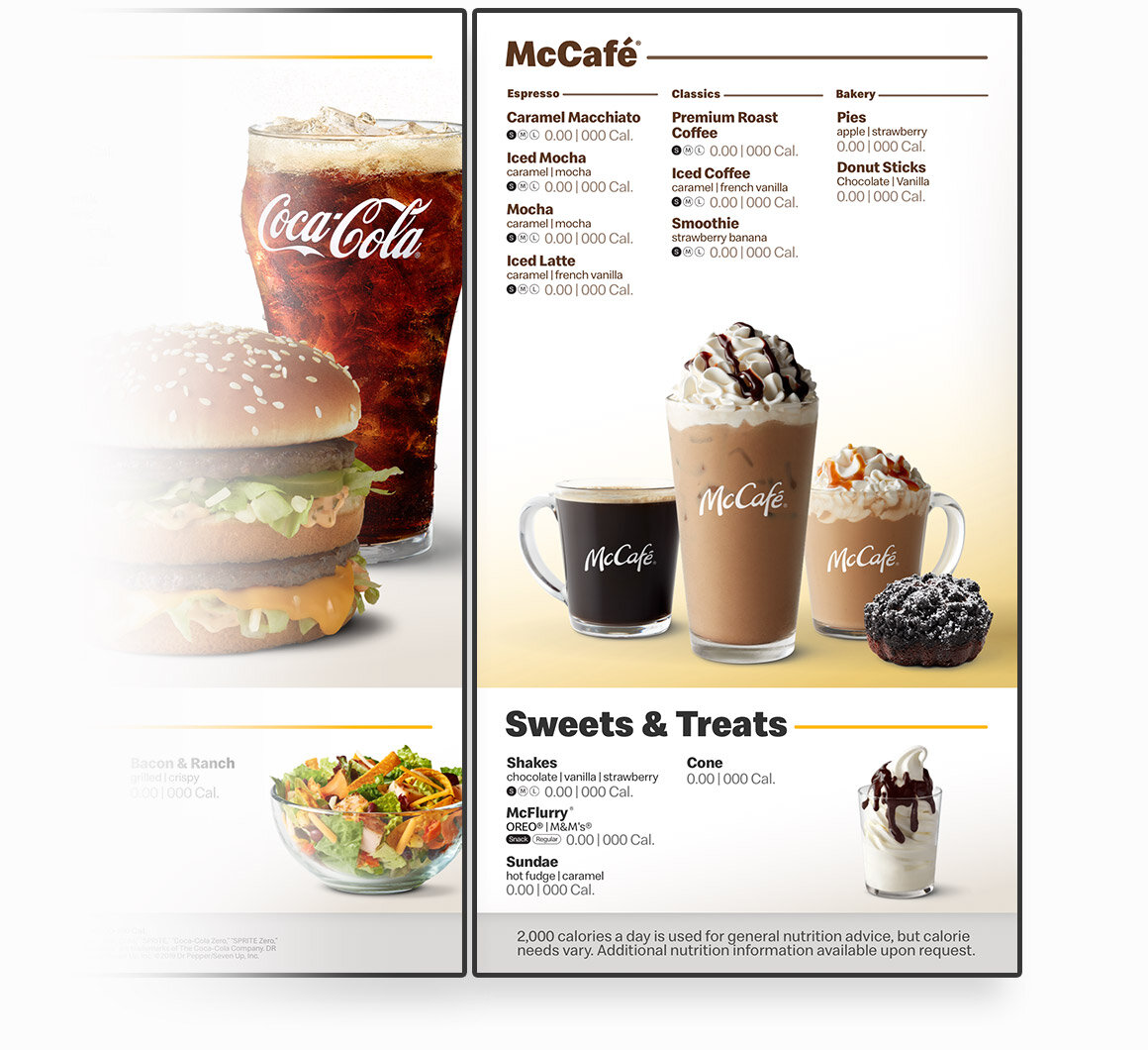
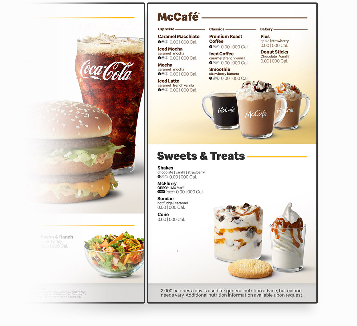
As an example, some restaurants don’t have espresso options available. So McCafé can shrink and add more room to another category like Sweets & Treats.
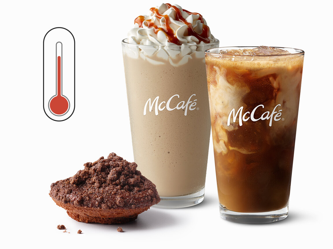
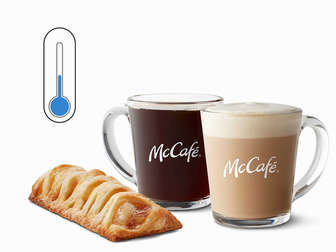
McCafé adapts to the weather outside.
If it’s cold outside, the menu will offer you more choices in hot beverages, like coffee and cappuccinos. If the weather is hot out, the menu will offer more frozen drinks like, smoothies and frappés. Just another perk to using Sketch from the start.
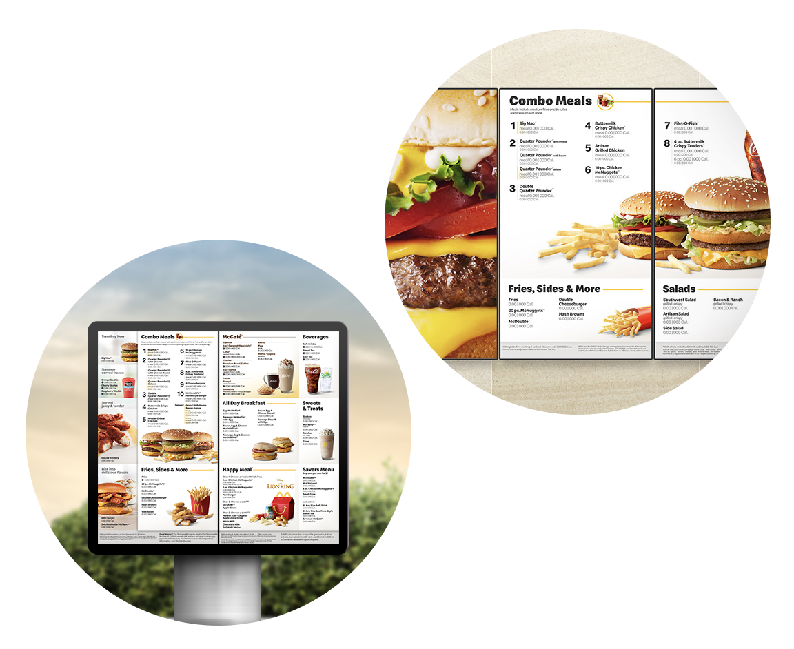
One simple design across all menus.
For the first time, the in-restaurant menu boards and drive thru menu all share the same design.
Big. Bold. Beautiful.
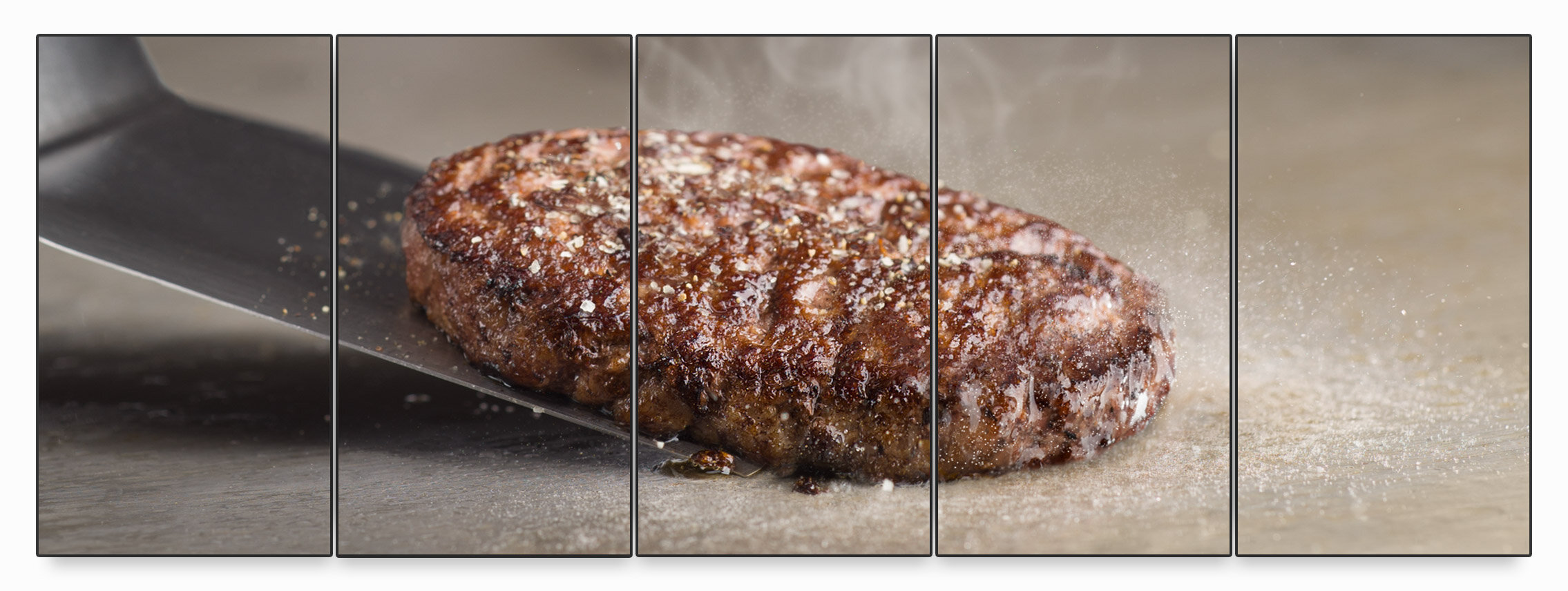
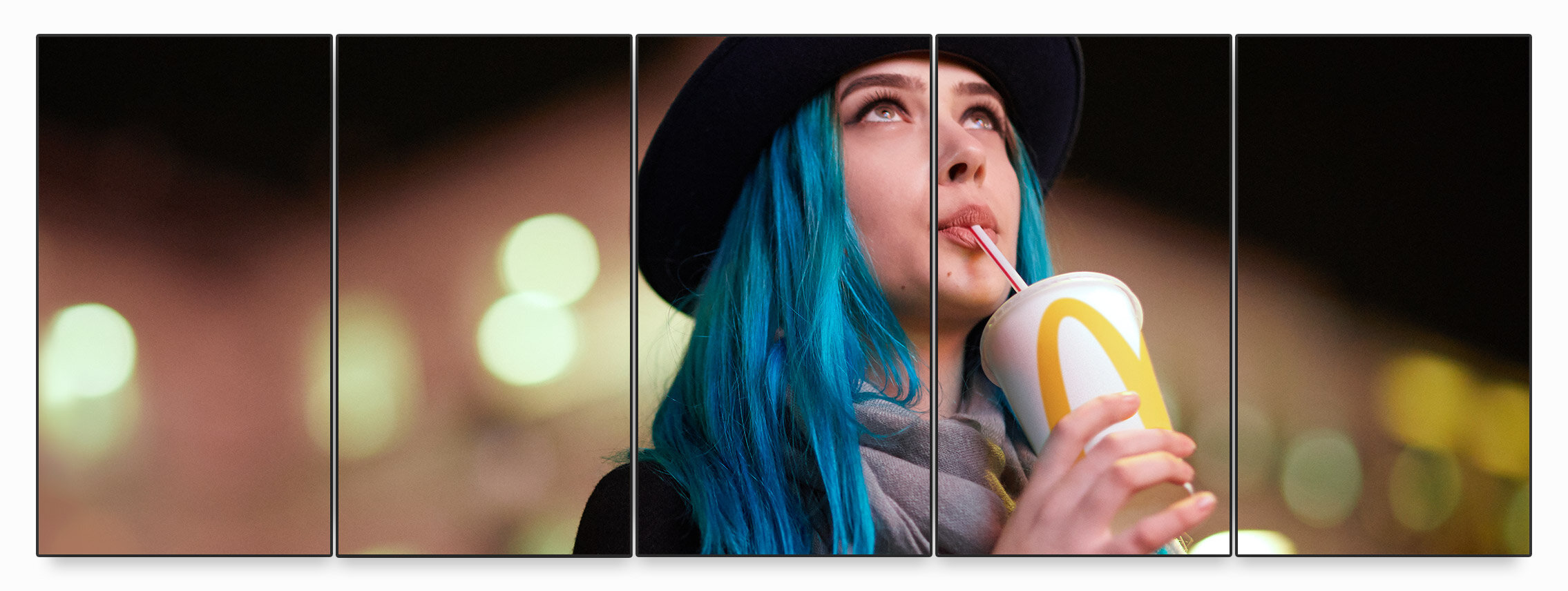
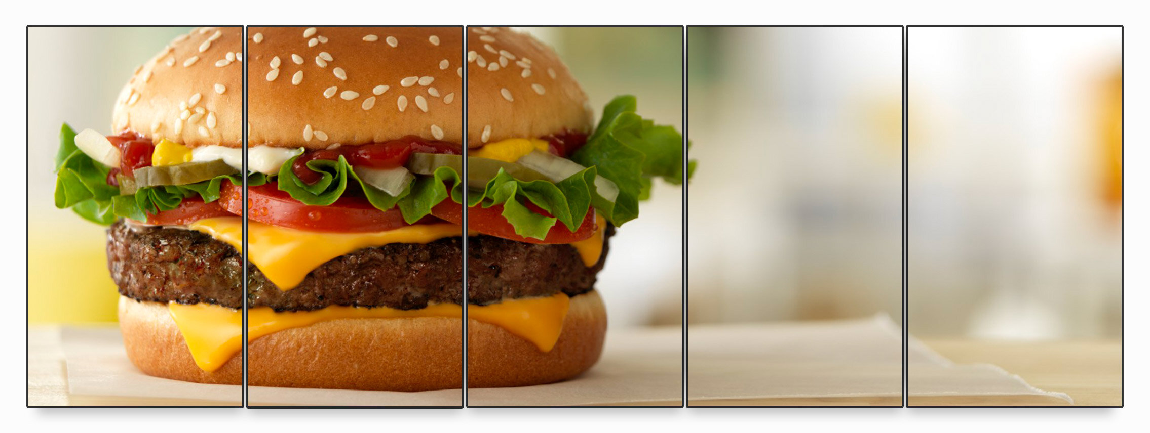
Something new that certain flagship restaurants in Chicago are testing is mobile ordering only. This allows us to turn the menus into giant walls of art - featuring food and lifestyle photography.



![LOGO [Recovered]-13.png](https://images.squarespace-cdn.com/content/v1/5db5cda062d0152e8e43137b/1573330132626-EWT9TLG3TYYOS07JYU2J/LOGO+%5BRecovered%5D-13.png)
